Happy First Day of Fall!
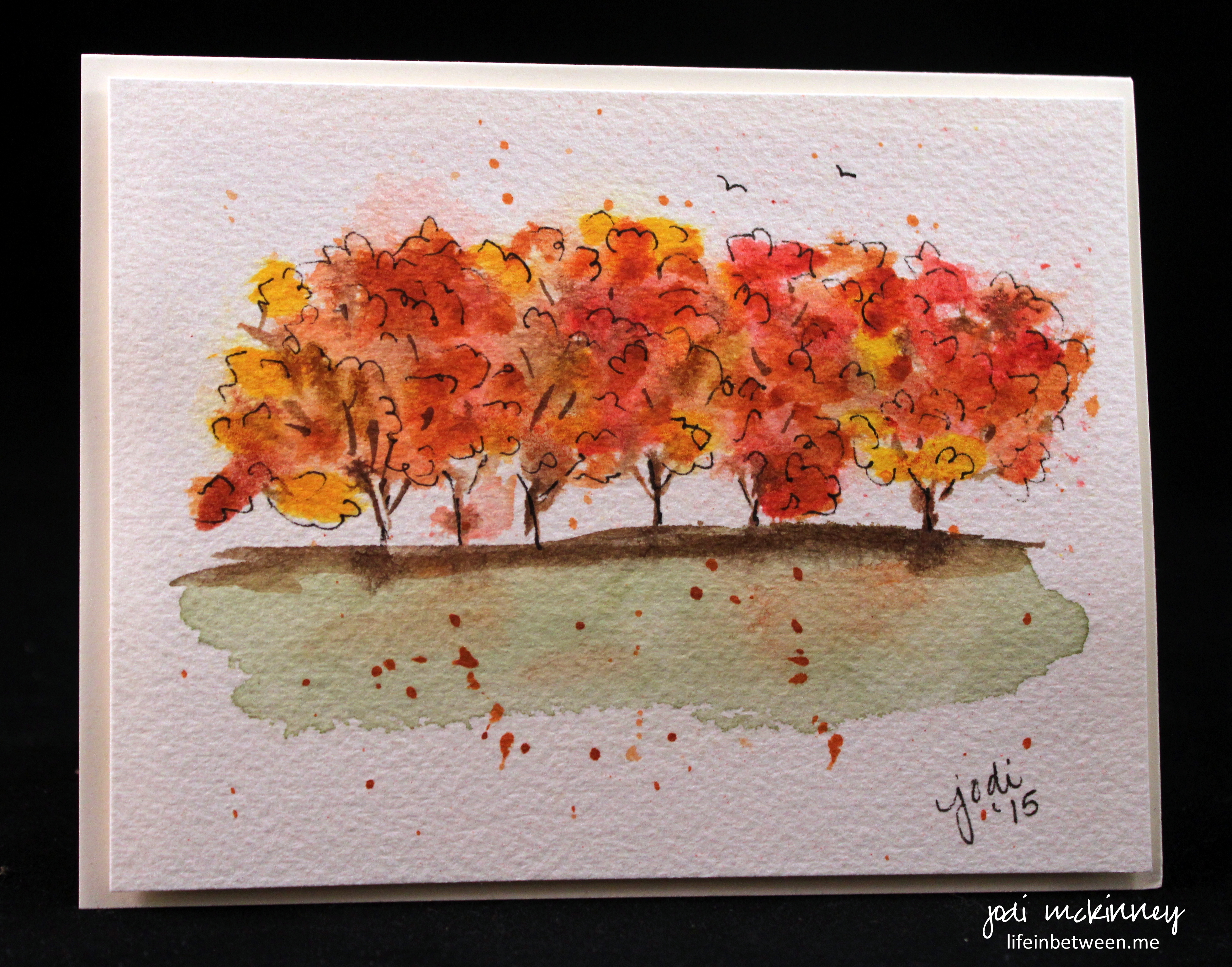
The other day – as I continue to convince myself how much I love Fall (and it really is happening!) I dabbled with a couple abstract watercolors of Autumn trees. One I “doodled” up and the other I didn’t.
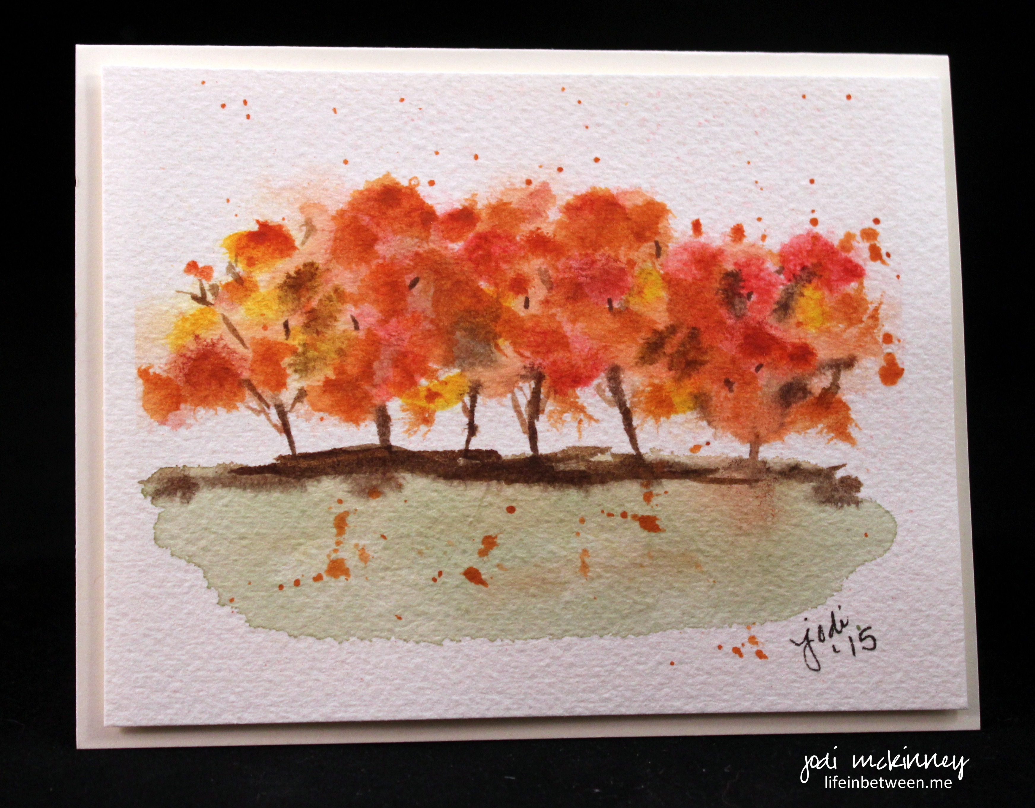
Interesting what a different effect it gives. And more interesting – I kind of like both. (what do you think of that Charlie O and Laura!?!?)
So I asked my guys that evening, “Which do you like better?”
Hubby picked one… and my son, Nick, picked the other.
I knew that was going to happen!
Which one do you pick?
Cheers & Hugs,
Jodi

I love them both! 🍂🍂🍂
LikeLiked by 1 person
Cheater – lol! 🙂
LikeLiked by 1 person
I love the first, the one with the doodles. A bit more defined. Not as washed out. But then can those vibrant fall colours ever really be washed out?
LikeLiked by 1 person
hi Jodi, they are both very lovely and very Autumn like. Well done 🙂 If I had to select 1, I’d lean towards the top where you’ve used the Dark Pen for accents. Those deeper dark tones …. kind of help the overall tonal balance, giving it more definite Dark, Mid, Light tones. (imo) I like the 2nd as well!
LikeLiked by 1 person
I love your perspective and appreciate your comment Deb.
LikeLike
I can’t choose between them, so I vote both! Love the colors of autumn and the cooler weather (for about a week or 2)
I grew up just loving summer’s freedom from school, staying outside late, no shoes, fun of swimming, fireflies, laying on top of the covers at night, so hot! Still my favorite season.
But fall is pretty great too. All the yummy apples and pears and veggies from the garden, my mom made jelly from the Concord grapes and elderberries that grew in our backyard.
If only winter was shorter, with spring beginning shortly after the holidays:)
LikeLiked by 1 person
I totally hear you Mary! You couldn’t have expressed my feelings any better kindred spirit! 🙂
LikeLike
They’re both pretty in their own way. The top one is more illustrative with the ink outlining, but the bottom is more fine artsy. 🙂
LikeLiked by 4 people
I appreciate that explanation – I think you are right – I guess it is why I can’t decide. illustrative vs. fine artsy. Hmmm I like both styles – which is mine???? Not sure yet…. Or can I be both??? 🙂
LikeLiked by 3 people
It sure can be both! Embrace them equally! 😀
LikeLiked by 1 person
Here’s the funny thing…when I looked at them, my instinct was to pick the top one, but I realized that if I was shopping, I would purchase the “undoodled” one. Love them both though.
LikeLiked by 1 person
I think that is how I feel too Kathy. I still look at them in person and can’t decide . But it is a great feeling to actually like them both – kind of a lot (blush) 🙂
LikeLiked by 1 person
Boy I can’t decide! I agree with Teresa. I think they are both great, for different reasons. I wouldn’t know which to choose if I were shopping somewhere! I’d probably get both! They are beautiful and I love love love your semi-abstract watercolors. They are wonderment and I am cheering you on, MacDuff! Or McKinney. Bah, whatever. lol! 💛💛💛💛💛
LikeLiked by 1 person
🙂
LikeLiked by 1 person
They each make me feel a different way. The bottom one is more relaxing, the top one more exciting! So I like them both. I love fall and all its colors too.
LikeLiked by 3 people
I love that explanation. You nailed it – exciting and relaxing – I like that! Thanks for taking the time to express your thoughts Nancy! I appreciate!
LikeLiked by 1 person
I would choose #2. Very Japanese. (K.)
LikeLiked by 1 person
🙂 Awh! Thanks!
LikeLiked by 1 person
I love both of them Jodi! But my favorite is the first one. Beautiful job on these fall trees! BEAUTIFUL!!
LikeLiked by 1 person
Both are so lovely! I am “drawn” to the first one with the doodling. I am amazed how your watercoloring is so precise yet loose…does that make sense? I am enjoying your journey, Jodi:)
LikeLiked by 1 person
Thanks so much Cindy! 🙂 I have no idea what I am doing – haha! I’m just having fun. I think I do understand your comment and will take it as a compliment 🙂 xxoo
LikeLike
Love these!! ❤️Hehe…I was thinking of a brilliant way to avoid choosing, but my coffee hasn’t kicked in so neither has my brain. 😊 So I won’t cheat…my personal preference is always the inky one! But you probably already knew that! Both are beautiful, of course! (And Philippe picked the second one…hehe, which is equally no surprise!)
LikeLiked by 2 people
Haha! Love it that you each picked different. Just like my guys. I would have been surprised if Mr Doodlewash himself didn’t pick #1. But then you never know… Especially pre-coffee. And… After a night of drunk doodlewashing and a cappella. 😝😜😉
LikeLiked by 3 people
Shhhh…that was a secret! Oh crap…I blogged it. Yeah…maybe I was drunk. 😳
LikeLiked by 2 people
Hi Jodi, of course I love them both, but I lean to the second one. I like the soft watercolor blends. It’s always a treat to see your creative art!
LikeLiked by 1 person
Awh! ☺️. Thanks Sharon!
LikeLiked by 1 person
Just love them both but think I like the black lines better. You are truly inspirational.
LikeLiked by 1 person
Awh☺️ thanks Nan! And you are so sweet!!
LikeLike
Both are spectacular!…. Since you’re making me pick…. The doodlewash 😉 Jodi I want to try the whole doodlewash thing, what kind/brand of supplies do you use? Your watercolors look great!
LikeLiked by 2 people
Thanks for choosing Nicole! Let’s see – basic supplies – a few great M Graham tubes of watercolor paint and/or the Sakura Koi watercolor field kit, Micron pen .05, Arches 140 lb cold pressed watercolor paper, water. That should do it! 🙂
LikeLiked by 1 person
I like them both Jodi! Such a beautiful fall scene! YAY Jodi!!! 🎨🍁🍂🌟
LikeLiked by 1 person
Cheater Jill! I really was counting on YOU to choose one or the other…. 🙂
LikeLiked by 1 person
I’m not good at choosing one subject or art medium – just look at my blog! lol
LikeLiked by 1 person
Both are equally awesome! I love this fresh colors! I like those branches showing in between the leaves and toes tiny birds too! Outline have added more accent to it! 🙂
LikeLiked by 1 person
Number one, has more Earth tone to my colorblind eyes. ❤
LikeLiked by 1 person
haha! They are the exact same colors – done at the same time – but one has added micron pen “doodle” lines. Crazy what a different it makes – eh?
LikeLiked by 1 person
Jodi, I like both! However the “doodled” up one has more definition. So I might be leaning toward that one. It would depend on my mood though. I’m usually in a detailed kind of mood, not dreamy abstract! Chryssa
LikeLiked by 1 person
Hi chryssa! Thanks for chiming in with your opinion! Love it!
LikeLiked by 1 person
Most definitely the doodle one. I love the character the card has with the defined, yet totally undefined lines. Made me happy to see it. Would you like my snail mail address?
LikeLiked by 1 person
I love your definitiveness in your opinion Linda! 🙂 thanks for sharing!!!!
LikeLike
Gorgeous paintings. Both are lovely with their own vibe. I gravitate to the second image with its blend and layering of color, it has an elegant voice. Thank you for sharing them.
LikeLiked by 1 person
Thank you! Aren’t you sweet?! Thanks for sharing your opinion! I like thinking I did an elegant panting 🙂
LikeLike
I really like the first one, but I love all your paintings! 🙂
LikeLiked by 1 person
I am not sure they are both amazing and so full of Fall! I think the first one! lovely
LikeLike
Both stunning. The first one its still and quiet, and then along comes a blustery fall breeze.
LikeLiked by 1 person
Jodi, I really like the one that has the extra pen lines. very nice!
LikeLiked by 1 person
I like them both but I think that the second one is more ‘painterly’. The definition will say it all.
LikeLike
The birds in the first one was a nice touch, Jodi. And you defined the leaves in the trees. That’s my pick.
LikeLiked by 1 person
Both are quite nice, but I liked the doodled version more😊
LikeLiked by 1 person