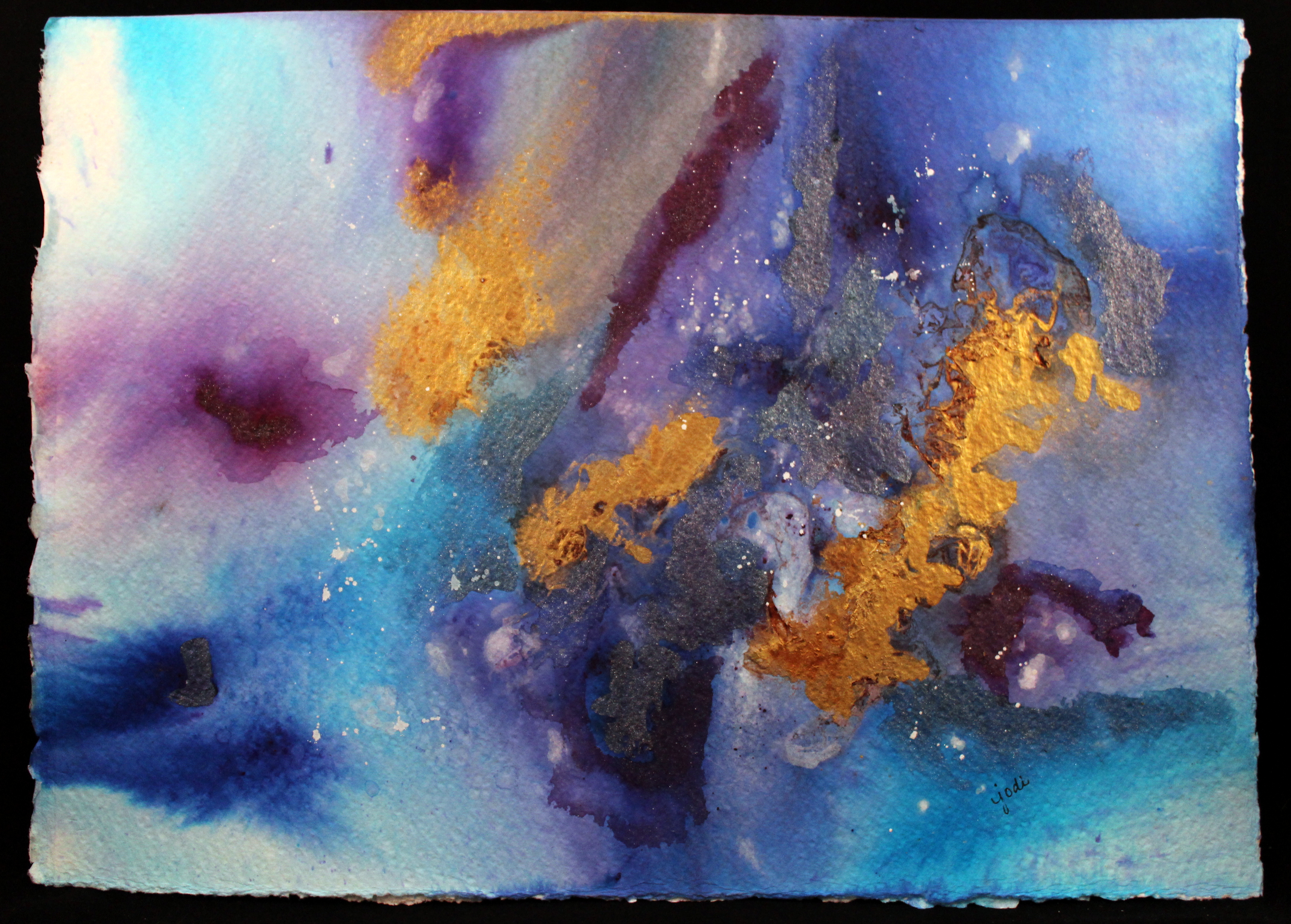
Abstract in Blues Purple & Gold 10×16 300 lb Arches Cold Press
“Reality is what we take to be true.
What we take to be true is what we believe.
What we believe is based upon our perceptions.
What we perceive depends on what we look for.
What we look for depends on what we think.
What we think depends on what we perceive.
What we perceive determines what we believe.
What we believe determines what we take to be true.
What we take to be true is our reality.”
– David Bohm
Abstract Watercolor done playing with products: BRUSHO Watercolor Crystals in Turquoise, Ultramarine Blue and Purple, Dr. Ph. Martin’s Iridescent Copper Plate Gold, Dr. Ph. Martin’s Bleedproof White, Winsor & Newton Iridescent Medium, Salt, & Saran Wrap.

yes, absolutely, jodi –
LikeLiked by 1 person
Just beautiful, Jodi!
LikeLiked by 1 person
thanks PJ! and something to think about eh? 🙂
LikeLike
Oh yes! Absolutely! 🙂
LikeLiked by 1 person
Cool Jodi! I have been wanting to experiment with salt and saran! Love the gold!
Jenna
LikeLiked by 1 person
It’s fun – I want to do more, but this was a fun experiment. 🙂
LikeLike
Beautiful.
LikeLiked by 1 person
🙂 Thanks Sylvia
LikeLike
Wonderful painting and words, Jodi! 😊💕
LikeLiked by 1 person
Thanks Ann!
LikeLiked by 1 person
Looks like a beautiful space vision! (K)
LikeLiked by 1 person
🙂
LikeLiked by 1 person
I love the colors here. Lots of little firecrackers going off looking at it.
I’ve been wanting to paint, but I am still standing back thinking about it.
LikeLike
beautiful and profound!
LikeLiked by 1 person
Thanks lynn 🙂
LikeLike
Very nice work!! 💕
LikeLiked by 1 person
Thanks John 💙
LikeLiked by 1 person
The gold gives it a nice pop! Looks like you had fun! YAY Jodi! 🎨💜💥 And wise words to ponder too!
LikeLiked by 1 person
I had the words first this time. Not overly pleased with this piece. But will try again with similar techniques. 😉💙
LikeLiked by 1 person
How would you like to change it? I’m just curious… 😃
LikeLiked by 1 person
I added too much iridescent and it needs more white /light left on it. It also needs a more focused focal point. Agree? 😝
LikeLiked by 1 person
I had to go back and take another look. 😃 I think you are right, it could use more of a focal point. The gold looks great but it is a lot like the color red… a little goes a long way! ❤ I don’t know if it needs more white. When I look at the Milky Way it doesn’t have a lot of light. So I suppose it depends on the look you are going for. 🌌
LikeLiked by 1 person
Thanks for looking again and your honest artistic eye!!! 😉❤😘
LikeLiked by 1 person
That quote makes my head spin so your abstract painting pairs with it perfectly!
LikeLiked by 1 person
Lol. Me too. I could read it over and over and it begins to make sense. The painting was done after the writing so I’m glad it represented well to you. 😉💙
LikeLiked by 1 person
Reality is an abstract concept, Jodi. Everyone sees it differently. I see realities merging in your painting.
LikeLiked by 1 person
Nice! Thanks Tom!!
LikeLike
Beautiful image! It pairs so well with that wonderful quote. It’s really gorgeous… I like it when you play!! 😍
LikeLiked by 1 person
Thanks Charlie! I painted it after the quote. 😉
LikeLiked by 1 person
Beautiful, Jodi! Love the bold, swirling colors! Nicely done. 🎨 Christine
LikeLiked by 1 person
Thanks Christine! Glad you enjoyed.
LikeLiked by 1 person
Trouble with iPad Jodi, my comment didn’t go thru! I love the blue and gold, of course!! Lovely Choices, you made… with paper and colors💕
LikeLiked by 1 person
Thanks Debi!
LikeLiked by 1 person
🙂 cheers, Debi
LikeLike
Brilliant ! Love the abstract vibe 🙂
LikeLiked by 1 person
Thanks Lynne! 💙💜💛
LikeLiked by 1 person
That is so true, and it helps explain all the heated political arguments we hear these days! But for the record, I rather like the reality you painted…..
LikeLiked by 1 person
😉👍💙💜💛
LikeLiked by 1 person
A beautiful abstract – gorgeous colours!
LikeLiked by 1 person
Thanks Evelyn!
LikeLike