Take Flight.
Take flight
above
the turquoise sea,
amidst
the pink and golden
sky.
Stretch
your wings
and soar so high,
let
freedom
guide your heart.
Embrace
the feelings
that you get
when you are
creating
art.
Cheers & Hugs,
Jodi
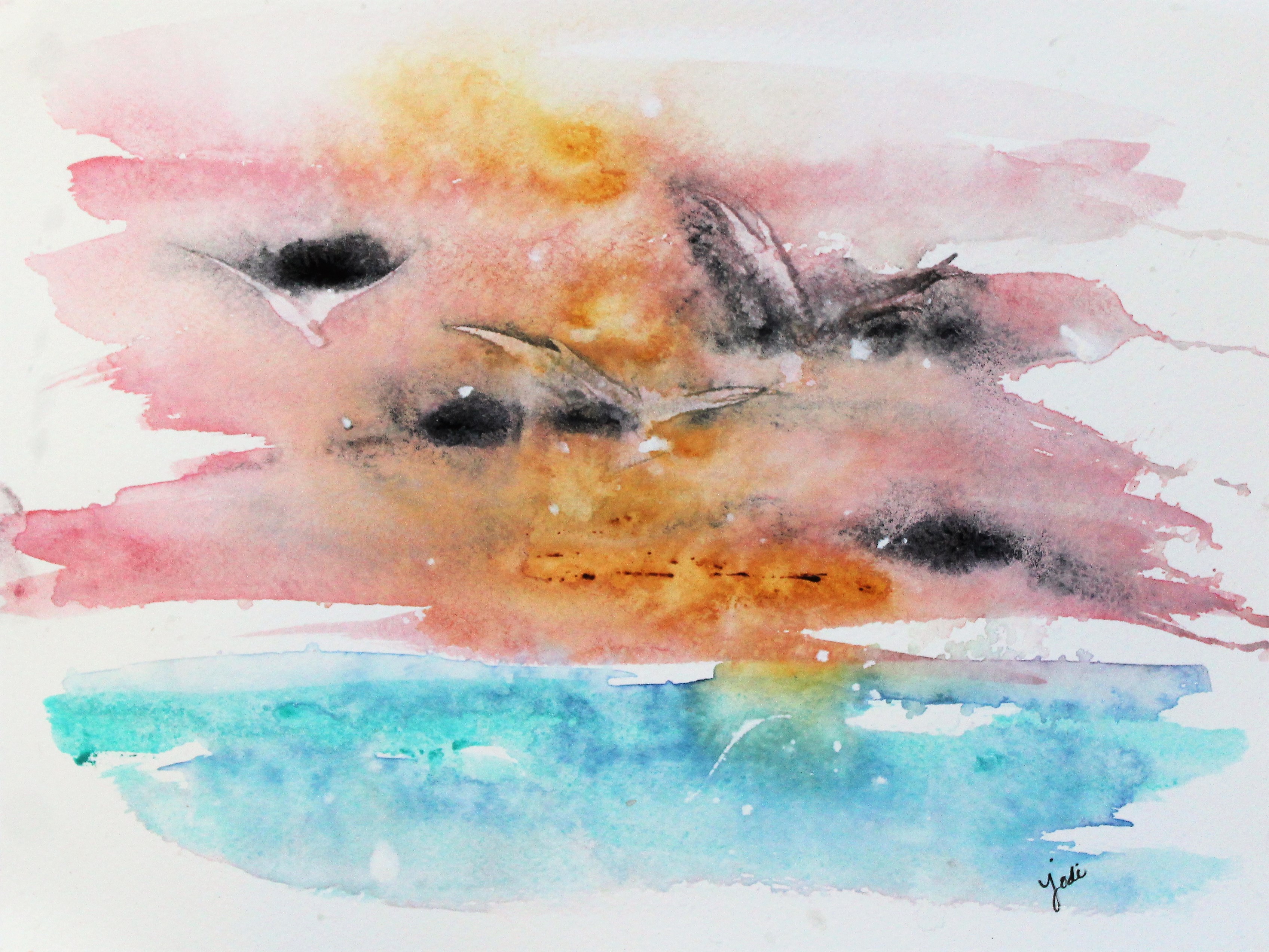
Just some words and feelings that came to mind when looking at this 5-minute practice painting I did one day experimenting with techniques.
What did I do? I dropped in some granulating colors – lunar black and quinacridone gold to a wash of alizarin crimson. I then splashed in some creamy white gouache to create a soft, but dramatic sunset sky. I scraped in some flying sea gulls with a couple simple scrapes of a palette knife. I blended cobalt teal with a dab of prussian blue and splashed in some more creamy white gouache. I then splashed some drops of water from a mister bottle and dropped in just a couple flakes of sea salt. I then walked away and waited for the magic to happen…. (the hardest part of all).

Beautiful
LikeLiked by 1 person
thank you Beth – I’m glad you like.
LikeLike
Wow. It seems like you had a hectic five minutes during which you created your painting. I really like your choice of colors and the way that you show us that it is not always necessary to have lots of details to establish a mood. Your beautiful words complement the painting so well and allow us also to take flight for a brief moment.
LikeLiked by 2 people
Thanks Mike! Does it feel “hectic” to you?
LikeLike
The painting itself does not feel hectic at all–it looks deceptively simple and natural. The “hectic” comments comes from your detailed description–which I really welcomed–of all that was involved in creating it.
LikeLiked by 1 person
I like it! At my first glance I figured you were testing your skills at abstract art. Then, after reading your blog title, I thought that you were trying to depict an air plane leveling off after takeoff with various sections of it showing thru the sky at sunset. Then after reading your detailed process I realized that the black-gray areas in the sky were actually meant to be birds. But, isn’t most art from famous artists often left up to intepretation. That’s what makes art interesting. Remember the days as a kid, laying on the grass and looking up to the puffy clouds in the sky. You would visualize certain things from the cloud shapes while your friends may visualize something else. The mind works in interesting and different ways by different people when looking at various things. That’s what makes life interesting. Gary
On Feb 12, 2018 6:02 AM, “the creative life in between” wrote:
> Jodi posted: ” Take Flight. Take flight above the turquoise sea, amidst > the pink and golden sky. Stretch your wings and soar so high, let freedom > guide your heart. Embrace the feelings that you get when you are creating > art. Cheers &” >
LikeLiked by 1 person
I love how much thought you put into it, Gary! And the time you took to tell me about what you saw and how it made you feel! Thank you so much for sharing! That is what art is about!!
LikeLike
No problem Jodi. Thought you would enjoy how I interpreted your new masterpiece. Keep creating….you are really becoming a true artist! Gary
LikeLiked by 1 person
aww – thanks sweet Gary!
LikeLike
I would say that your patience was rewarded! Lovely shade of turquoise. 🙂
LikeLiked by 1 person
thanks C! Sometimes it is so fun just to throw paint down and see what happens 🙂
LikeLiked by 1 person
You throw paint down and magic happens! 🙂
LikeLiked by 1 person
Not always!!! Many get tossed, but that’s okay, because it makes it that much more special when the magic does happen 🙂
LikeLike
There you go! Great way to look at it. Not everything I write on paper turns to magic either , it also gets tossed. LOL!
LikeLiked by 1 person
A nice way to start the week. 😊
LikeLiked by 1 person
Thanks Kathy. Hey did you ever see my post of “Kathy’s Bluebird?”
LikeLike
I don’t think so. How did I miss it???
LikeLike
A successful experiment with color and textures, thanks for explaining your process too. Lovely words, Jodi.
LikeLiked by 1 person
Sometimes it is so fun to see what will emerge. 🙂
LikeLiked by 1 person
That’s the magic we love.
LikeLiked by 1 person
So true!
LikeLike
Beautiful painting Jodi and beautiful poem!
LikeLiked by 1 person
Thanks PJ!
LikeLike
I like your poem very much, as delicate as your water colour art. Anything planned for Valentine’s Day, Jodi?
LikeLiked by 1 person
Thanks Peter. Nothing special planned. We usually don’t fuss much over Valentine’s day. Do you?
LikeLiked by 1 person
I usually write a poem for my wife together with a little gift.
LikeLiked by 1 person
Perfect ❤️
LikeLiked by 1 person
So awesome Jodi, it is really breathtaking!
Jenna
LikeLiked by 1 person
aww – thanks Jenna!
LikeLike
This is so soft, so lovely and your words accentuate the beauty!
LikeLiked by 1 person
Thank you lynn
LikeLiked by 1 person
A lovely creative experiment Jodi….
LikeLiked by 1 person
Thanks Evelyn!
LikeLike
Jodi, I love all of your new creations! Your talents grow! ❤️
LikeLiked by 1 person
Thanks John!
LikeLiked by 1 person
😬❤️😎
LikeLike
WOWZA!! LOVE this one so much!! And your poem is so true!! I just love that art gives you such JOY and you like experimenting like me! ❤️ YAY for play!! 🎨👍😊
LikeLiked by 1 person
Thanks for appreciating Jill! ❤
LikeLiked by 1 person
Lovely. Can’t get enough of birds! (K)
LikeLiked by 1 person
🙂
LikeLiked by 1 person
Wow how fun was that! What ever gave you the prompt for that experiment ? So glad you detailed that, I felt like (just for me). Haha. The gouache does it slow the spreading motion ? It does make pretty pastel. I just purchased some new Daniel Smith colors, cant wait to play with them. My local Hallmark store is 1/2 art store, its so wonderful, and every year (Feb1) they have 1 day 50% sale on Daniel Smith. This year I purchased some experiementing colors.
Rose of Ultramarine (red/blue, purple seperation color) like you don’t know what your going to get). Very different.
Cascade Green a (blue/turq seperation), and. Loving this one
Sugilite a sparkly version of ? Sodalight ? My guess.
Lavender (blue periwinkle),
cobalt violet (pinky) and granulates like crazy, very similiar to Wisteria but very different characteristics
cobalt violet deep (purple color) and granulates like crazy
Mayan Red. (Kind of peachy, or coral but RED). Loving this one
Mayan blue kinds of peacock, prussian lovely shade of dark blue
Red Fuchite. (Not so impressed yet). I have Fuchite (aqua green color so transparent with amazing glitter qualities, like buff and shugilite. I was hoping Red Fuchilte would be similar, but not at all. The color is similiar to potter pink and/ or Indian red, there is a glittery to it, but its sparce. I’ll have to see if kneading the paint tube gives me better results.
Boardeau a deep red wine colour, very similiar to Napth Maroon but not as dull, much brighter.
I’m watching my grandaughters in the Bay Area 1 hour plus from San Francisco, so won’t be playing for another week, but so much to look forward to. It’s a week of Board Games. Jr high, and Hi School activities.
Would you tell me again what color and brand your gouche is, I can probably find it here because shopping centers are everywhere here. I have Michaels, Jo-Annes and a Hobby Lobby all in 15 minutes here!
LikeLiked by 1 person
Wow Dena! You have me so intrigued with these colors!!! I have none of them, but you have me tempted to get a few now! Do you share your art anywhere that I could see? I wish I had an art store nearby that sold DS paint. I typically just order from Amazon. That is great your Hallmark is half art store. LOVE THAT! The gouache I have is Winsor Newton. I am having so much fun using it with watercolor!
LikeLike
What color white is it? Titatium, zinc, permanent??? No dont usually post. I’ll let you know once I play with them. I think you would love the cascade green. It just washes and seperates so beautifully. Great for mermaids, turtles, oceans, and backgrounds, as well as leaves. I’m not sure how I’ll use the Rose of ultramarin yet, I did a simple loose flower, its lovely, but I’m sure there is so much more you can use it in. I’m usually not big on high granulated colors, but those 2 have facinated. In fact I dont care for ultramarine blue, it seperates out and the color always gives me a depressed feeling, like a gloomy day. So I’m changing to cobalt blue. Not sure why it does that, I have some vision issues, in part colorblindness toward green I think, not much but, I don’t think I see colors the same as everyone else. Since I noticed this, a few years ago, I started studying colors, and using some I didn’t like. I’m also using perylene green, instead of deep sap green, I like whatever the undertone in it, much better and I found out you just never use it by itself, add purple, indian red, or ochre.
LikeLiked by 1 person
Good question on the white. I had to go look. I have “permanent.” So impulsive am I – I just ordered Cascade Green, Mayan Red, and Cobalt Violet. I am so intrigued by granulating colors. I adore perylene green. Learned about it through Andrew Geeson videos. Oh how I’d love to see your work Dena. If you have any to share, you could email me at mckinneyjodi@gmail.com. 🙂
Sounds like you will be busy with the grands, which seem to be teens! My granddaughter is already 14 months – and she is going to be a big sister in a few months to another baby girl 🙂 ssshhh!
LikeLike
Enjoy as much time as you can with them. 14 years go in a flash. They are into to friends and phones etc now, not so much the Nana. I put your email in my contacts. Let me know how you like those colors. I have Quin coral and I’m hoping the Mayan red compliments it. I know perylene green is wonderful. I just signed up for classes with Andy Geeson! (Christmas Gift from my mother in law)
LikeLiked by 1 person
❤
LikeLike
Truly beautiful
LikeLike
This is so beautiful and inspiring, thanks for sharing your talents and positivity.
LikeLiked by 1 person
Thanks so much!
LikeLike
The magic did happen!
LikeLiked by 1 person
Thanks Ann! 🙂
LikeLike
Seagulls and the beautiful scenery made me happy, Jodi. Thank you! 🙂
LikeLiked by 1 person