Painting Purple Posies

Purple Crocus Spring Watercolor 10x14" 300 lb Arches Cold Press

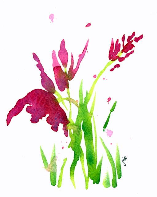
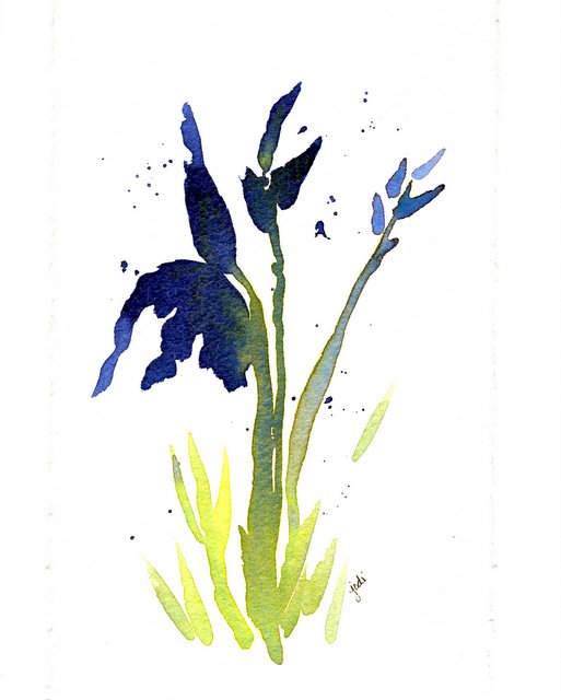
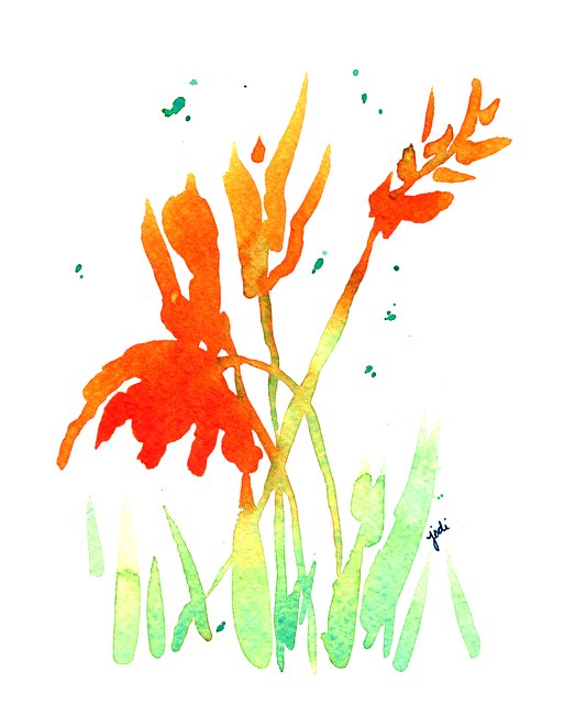
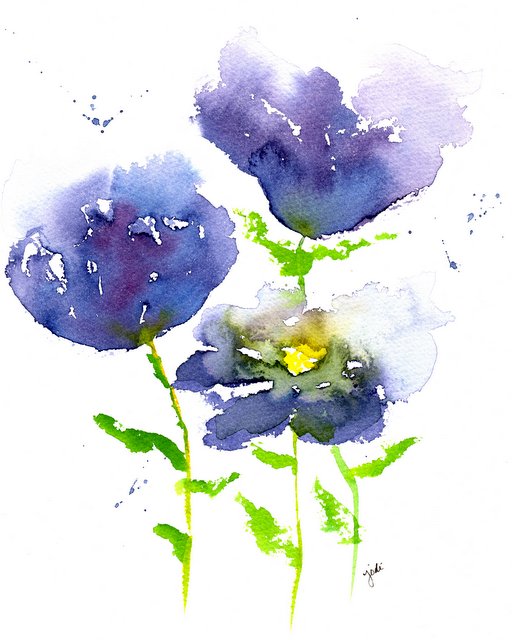
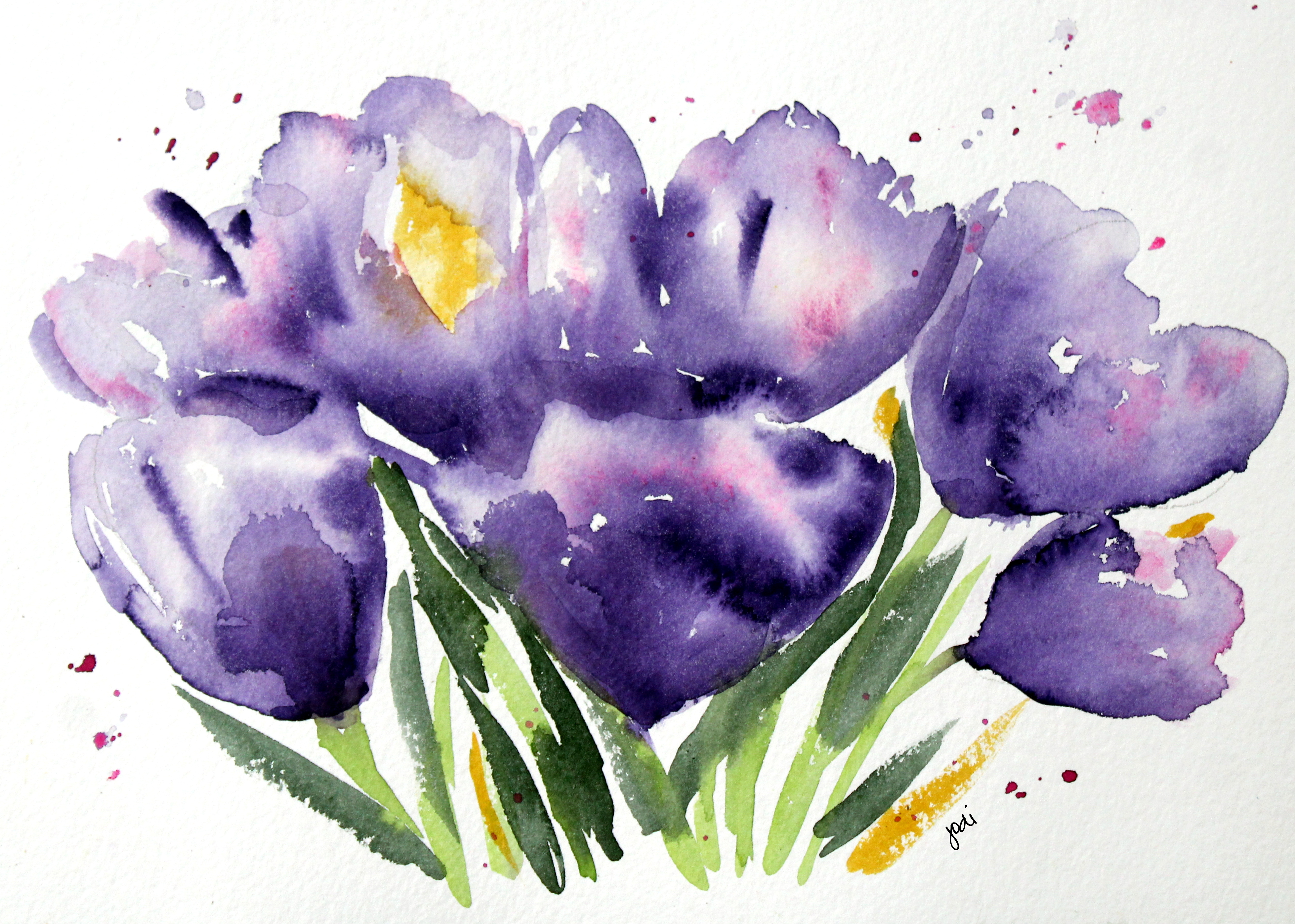
Purple Crocus Spring Watercolor 10×14″ 300 lb Arches Cold Press

Painting Purple Posies.

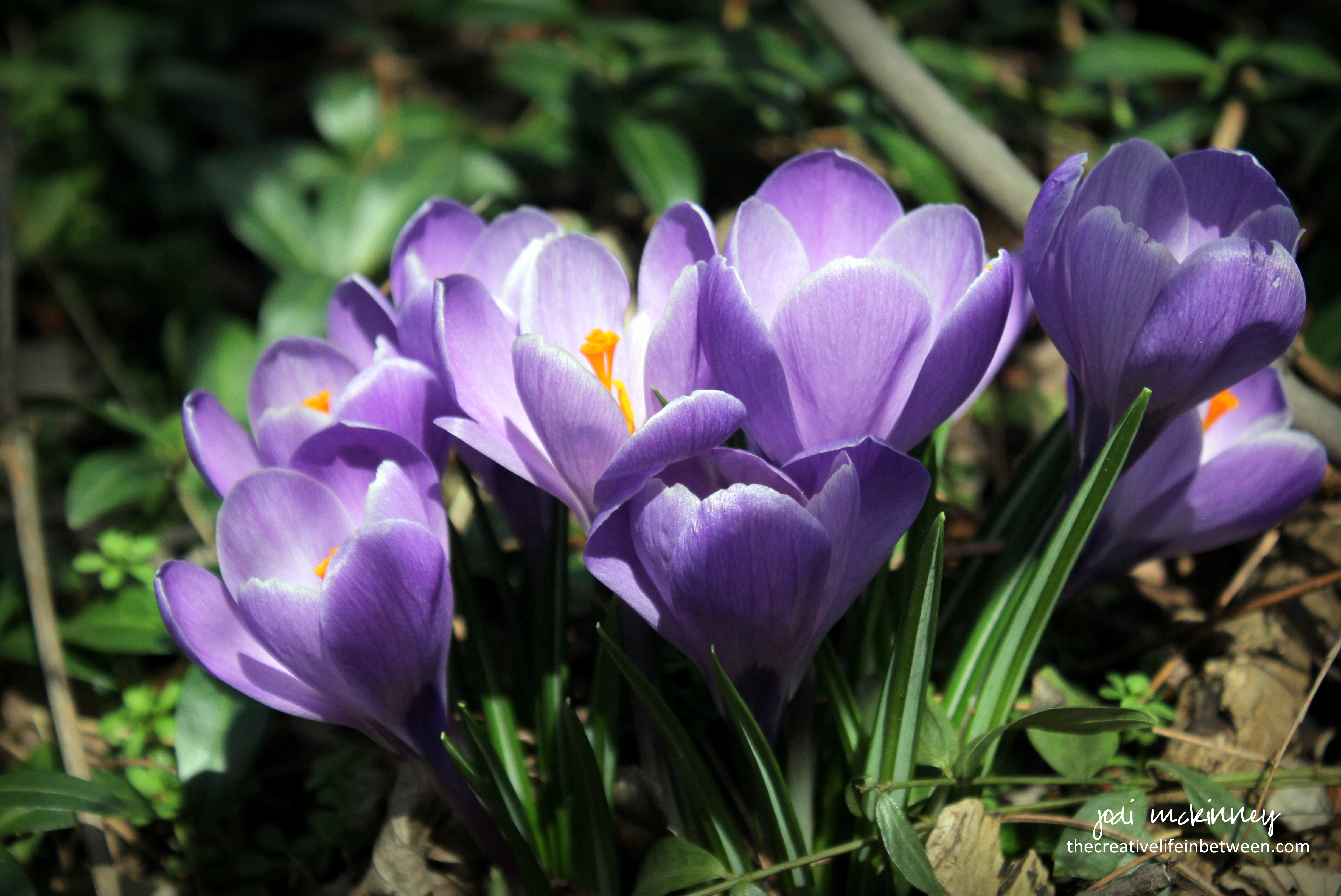
Though I could never create the beauty Mother Nature does…

especially in Spring when the purple crocuses pop up and  remind us once again of the hope of life and rebirth and renewal…

I couldn’t resist painting my impression of these beauties I captured and posted yesterday.

It was good to splash some Winsor Violet and Opera Rose and Prussian Blue and Cadmium Yellow with a touch of Perylene Green.

And instead of trying to recreate them, my goal was to paint how they made me feel.

I struggle with stopping here or filling in the details to make them look more realistic.  But ultimately, my love for impressionistic painting wins, and I stopped.

Before I ever ventured into this amazing joy of painting, I would have thought this way easier than exactly duplicating or painting more realistic representations, but the urge to “fiddle” and “replicate” typically leaves me feeling less satisfied.

To restrain….

To stop “before…”

To leave a bit – even if only a teensy bit – to the imagination…

is a challenge…

But a crazy and totally fulfilling, joyful experience when it works.

Not convinced I hit it with this one, but the joy  in the journey might just be as satisfying as the ultimate goal.

Kinda like life – huh?

It’s a journey – meant to be embraced and expressed and felt – all along the way.

Once we reach the destination – then what?

Cheers  & Hugs,
Jodi


Spring Surprises Popping Up

Spring Surprises Popping Up.

Is anything more beautiful
that the bright pops of purple and yellow
that come in the Spring to brighten the brown and gray
and highlight the fresh new green?

Especially in unexpected places
on unexpected adventures
with people you love
on Sunday “rides.”

Spring is popping up.
Smell the air.
Listen to the sounds.
Look for the beauty!

Cheers & Hugs,
Jodi

It Is Easy Being Green

Mixing Basics in Watercolor: Blue, Red, & Yellow


Mixing Basics in Watercolor:  Blue – Red – Yellow.

Going back to basics with my new watercolor palette and realizing all the colors that can be created by using three simple basics.  For all three of these simple, loose, impressionistic flowers, I used the same colors:  Cobalt Blue, Permanent Rose, and Lemon Yellow.

For the first I mixed Permanent Rose with just a drop of Cobalt Blue for the flowers and Cobalt Blue and Lemon Yellow pretty equally for the green.

For the second I mixed Cobalt Blue with just a drop of Permanent Rose for the flowers and Cobalt Blue and Lemon Yellow with an emphasis on the Cobalt Blue in places nearer the flower.

For the third I mixed Lemon Yellow with just a drop of Permanent Rose for the flowers and Cobalt Blue and Lemon Yellow, but only a tiny bit of Cobalt Blue to lighten up the green.

And there are likely hundreds more color combinations in various shades that could be achieved by simply using these three basic colors.

It’s fun and easy and creates such clean, bright, un-muddied results when you keep it simple.

I also used one brush for everything – the Rekab 320S #2 Squirrel Mop (which I could only find by ordering from Australia, but LOVE it – also recommended by Debi Riley),  It is so versatile, but I really had to learn to use it after using inexpensive synthetic brushes at first.  This brush holds a lot of water and paint.  It also can come to a fine point and do small lines with a light touch, and can make fat, wash strokes too.

So if you are even thinking of giving watercolor painting a try…. three colors, one brush (you don’t have to order from Australia – but find a nice natural hair medium sized brush to achieve results you will really enjoy) and some paper (I recommend you start with Cold Press 140lb Arches) is really all you need to create some beauty and experiment with this wonderful hobby.

Thanks to the inspiration of Debi Riley on Watercolor Basics!  So much to learn from such talent!

Enjoy the journey!

Cheers & Hugs,
Jodi

I’ve Got the Blues

scan20170227_22045323

“I’ve got the Blues” Watercolor 8 x 10 Impressionist Floral

I’ve got the Blues….

The watercolor blues…

creating shades of purples and greens by mixing Phthalo Blue with Permanent Rose and Hansa Yellow.

Yep – I’ve got the blues…

The Happy Blues.

Cheers & Hugs,
Jodi

Colors Used:  Daniel Smith Phthalo Blue, Hansa Yellow Medium, Permanent Rose.  Fabriano Artistico 140 lb. Cold Press Paper

Purple Irises in Watercolor

purple-iris-2-black-border-matted

Single Purple Iris Watercolor Loose 8 x 10

Purple Irises in Watercolor.

Continuing on my kick of violet and crimson and gold
and thinking floral…
and thinking Spring… (it continues to be in the 60’s and sunny here this crazy February of Spring in Western Pennsylvania!)

I created a couple iris paintings.

They are both very different, but I kinda love them both.

I painted these on Sunday after dinner on what was such a beautiful sunny, warm day.

I have to admit I gave purple irises a try on Saturday (in the midst of “construction” work on another project in the house).

I painted four or five different versions.  They were all terrible!

I hate days like that.  It makes me feel like I’ve “lost it.”   Not to say I’m anything magnificent in the whole big world of amazing watercolor artists.  But I’ve finally come to a place where I feel like I have some bit of my own style and can often appreciate the beauty in some of my work.

When I did this first one, I was so pleased.  I felt like I finally achieved what I was going for.

I thought I’d try another version, and I like it too.   In fact, I can’t decide between the two.  I wish the photos better represented what they look like – or maybe it ‘s just me, but they look so much better in real life.

purple-iris-1-black-border-matted

Single Violet Iris Loose Watercolor 8 x 10

Wishing you a day filled with simple little victories and moments to feel good about yourself!

Cheers & Hugs,
Jodi

Illusion

purple anemone illusion watercolor on 9x12 140lb arches

purple anemone illusion watercolor on 9×12 140lb arches

Illusion.

Sometimes
creating an illusion

of what it should be,
or could be,
or would be….

is more beautiful,
and more interesting,
and more mysterious…

than the reality
of what it really is.

Cheers & Hugs,
Jodi

Practicing from and inspired by Jean Haine’s Atmospheric Watercolour Book

Reality

abstract-blues-purple-gold

Abstract in Blues Purple & Gold 10×16 300 lb Arches Cold Press

“Reality is what we take to be true.
What we take to be true is what we believe.
What we believe is based upon our perceptions.
What we perceive depends on what we look for.
What we look for depends on what we think.
What we think depends on what we perceive.
What we perceive determines what we believe.
What we believe determines what we take to be true.
What we take to be true is our reality.”

– David Bohm

Abstract Watercolor done playing with products:  BRUSHO Watercolor Crystals in Turquoise, Ultramarine Blue and Purple, Dr. Ph. Martin’s Iridescent Copper Plate Gold, Dr. Ph. Martin’s Bleedproof White,  Winsor & Newton Iridescent Medium, Salt, & Saran Wrap.

A Beautiful Hello

summer phlox

I smiled at you,
and I said “hello.”

You smiled back,
and we both continued on our way.

When we crossed paths again
in the next aisle of our local supermarket

you stopped me,
and you looked directly into my eyes,

and you told me
I was the most beautiful person you have ever seen.

I looked back at you
more than dumbfounded.

I am clearly not the most beautiful person
even in the supermarket that day

let alone being bestowed such an honor
as the most beautiful ever.

I told you
I am sure you are mistaken.

You said, “Oh no,”
I’ve seen many.

I’ve lived a lot of years,
and I have seen my fair share of people.

These days, I rarely encounter
anyone who even notices me passing by their way

let alone one who looks me in the eyes and smiles
and genuinely greets me.

You are the most beautiful person
I have ever seen.

I will never forget you
though many years have passed.

My skin is becoming more like I remember
thinking yours was.

You made my day.
You made my week.

Heck – let’s face it –
You made my year – maybe two.

I am still far from the most beautiful,
but you made me realize

beauty is so much more
than the physical appearance.

You – sweet, gentle man
may be the most beautiful person I have ever seen.

You impacted me so deeply
and so profoundly.

You taught me a lesson
I have carried with me through my life.

A lesson that has carried me through times
of darkness and doubt.

Beauty can take on many forms
and be seen through different lenses.

Sometimes beauty is a simple, sincere
“hello.”


Cheers & Hugs,
Jodi