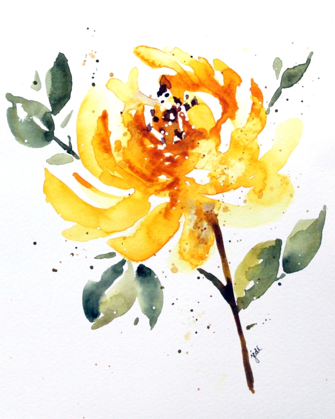
The broken
will always
be able
to love harder
than most.Once you have been
in the dark,
you learn
to appreciate
everything
that shines.
Embrace
the brokenness
and let
your light
shine.
Cheers & Hugs
Jodi
The broken
will always
be able
to love harder
than most.Once you have been
in the dark,
you learn
to appreciate
everything
that shines.
Embrace
the brokenness
and let
your light
shine.
Cheers & Hugs
Jodi
Power and Strength.
“Power isn’t
doing something
terrible
to someone
who is
weaker
than you…
It’s having
the strength
to do something
terrible,
and choosing
not to.”
– Franz to Reiner in The Storyteller by Jodi Picoult
When I came upon this statement made by one brother to another in the book I am reading, I knew I wanted to paint something that represented Power and Strength, and this painting was born. It is done using Daniel Smith Perylene Scarlet as I wanted an intense red. Then the real drama (I hope) is created with a unique rich color made by Daniel Smith called Piemontite Genuine. It is a shadowy red violet ground from a scarlet-streaked mineral from the hills of Italy that produces lovely violet-brown granulation with a carmine tone.
The color red is associated with energy, war, danger, strength, power, and determination as well as passion, desire, and love.
Red is a very emotionally intense color. It enhances human metabolism, increases respiration rate, and raises blood pressure. It has very high visibility, which is why stop signs, stoplights, and fire equipment are usually painted red. It is a color found in many national flags.
Other colors used: Daniel Smith Yellow Ochre, and Cerulean Blue.
I hope you feel the power and strength and intensity I wished to express in this painting, and I also hope the quote resonates with you about the true meaning of power.
Cheers & Hugs,
Jodi
Late Summer Dreaming.
Laying in the warm grass,
looking up at the clouds floating by,
listening to the cicadas sing.
Cool misty morning walks,
hot afternoon ceiling fans swirling,
earlier and earlier sunsets for bright star gazing.
Plump ruby red tomatoes fresh off the vine,
bushels of zucchini for spiraling and shredding and slicing,
roasted sweet corn, and fuzz covered juicy ripe peaches.
Late summer dreaming
inspired layers of transparent watercolor glaze
in varying combinations of Prussian blue, Azo yellow, and Quinacridone rose.
Wishing you sweet late summer dreams.
Cheers & Hugs,
Jodi
In the Pink – In a Blink.
I stare at my computer most all day for work.
Much of the rest of the time, I am looking at my iPhone.
We all need to give our eyes and minds and bodies a break.
When I have a half hour, I often take a walk.
When I just need to step away to regroup for five minutes,
I’ve been challenging myself to do a quick painting in under five minutes.
I just step away. Breathe. And try something new.
My art room is on a different floor from my home office, so I just step away a bit and escape for a few minutes. Art supplies always at the ready.
I might just try a different color paint than I typically use, a different style of painting, or a different size brush than I usually use. Anything just to clear my mind and regroup. I often come back to a task that was challenging me with a whole new perspective.
I have some scraps of failed paintings in a box that I can paint on the back of for practice, so I usually use those. Like I did for this one.
I typically just leave it sit and dry and walk away, go back to work, and then look at it later to see if anything emerges.
This one surprised me, and I kinda love it.
What do you do when you have five minutes and need to regroup?
Cheers & Hugs,
Jodi
Daniel Smith Watercolors used: Raw Sienna, Perylene Violet, Permanent Rose, Cadmium Orange, Olive Green. Brush Used: Isabey #4 Cat’s Tongue Oval Wash.
A Yellow Flower for Terry.
I have a friend named Terry.
His favorite color is yellow.
His husband’s name is Gary,
and they have a dog named Roxy.
Terry is a father,
a son,
a brother,
and a husband.
Terry is a handsome man in the fifth decade of life.
About a year ago, Terry and Gary sold their home in Texas,
bought a travel trailer and had plans to travel the country,
including a visit to Mars, PA, where I live.
About a year prior to that,
Terry began having some pain and health issues.
He knew something was very wrong.
Terry discovered he had cancer.
For the past two years,
Terry has sadly become increasing more ill.
The cancer is taking over his body.
But it has not, cannot, and will not kill his beautiful, loving spirit.
One of the many joys of blogging
is the community of other bloggers
and some very special friendships that are formed,
like the one that I have formed with Terry.
I’ll never forget the special way Terry made me feel one time in particular.
About a year ago and about a year into my new adventure in watercolor painting,
I painted and shared a not-so-great watercolor painting of a red boat.
Terry, in all his sweetness, told me it was “priceless” and he “would pay millions for it.”
So overcome with his kindness,
I offered it to him as a gift.
I sent it to him,
and he posted this beautiful way of thanking me: It’s a Jodi
Terry and Gary never did get to do the traveling they had planned.
They now reside in Florida, living in their travel trailer,
but Terry has spent more days than anyone would wish
at doctor’s appointments, chemo and radiation treatments, and the hospital.
My sweet friend Terry
is now on hospice care.
He has made the choice to live out his final journey
at home with those he loves in peace and comfort and love.
After seeing Terry’s post yesterday
and thinking of him so much,
I decided to paint a yellow flower of friendship
for a beautiful friend.
Dear Terry,
please know how much you are loved,
what an impact you have made on so many,
and how I will always remember you when I see yellow flowers.
Hugs,
Jodi
P.S. If you would like to visit Terry’s blog, please click on any of the hyperlinks provided throughout this post. I know it would mean so much to him and Gary if you would post a little note to him. If you do, please tell him how much Jodi loves him!
Watercolor: Winsor & Newton New Gamboge, Daniel Smith Olive Green, Perylene Green, Perylene Violet.
“If nothing ever changed,
there would be no such things as
butterflies.”
-Wendy Maas, The Candymakers
Embrace the change.
Cheers & Hugs,
Jodi
Butterfly watercolor inspired by the beautiful artistry of Dean Crouser
Gotta Cut Loose.
I've been trying to do a painting for a couple days that is just not happening right now.
Seems when I try too hard and set expectations for myself, it just doesn't happen!
<Ugh!>
So instead of trying it for the fourth time……..
I just let myself cut loose…
and do whatever came out…
and see what happened.
This happened.
And I kinda love it.
I played with some different colors than I've been playing with lately. This painting has Daniel Smith Cobalt Blue, Perylene Violet, Olive Green, and Quinacridone Gold.
Cut loose and see what you can do!
And in case you don't have the song in your head yet…..
Cheers & Hugs,
Jodi
On Hospitality…
“True Hospitality
is when people leave
feeling better about
themselves –
not better about
you.”
– – Shauna Niequist
My hope is that all who enter my home leave feeling better about themselves.
Better because they felt welcomed….. loved…….. and comfortable.
Better because their bellies were filled with yummy food.
Better because we shared good wine or good coffee.
Better because we laughed.
Better because we could be our authentic selves.
Better because we shared and created memories.
Better because they know they are always welcomed back.
Cheers & Hugs,
Jodi
Watercolor Pineapple – a sign of hospitality – using Daniel Smith Cadmium Yellow, Quinacridone Gold, Burnt Umber, Olive Green, Perylene Green on 11×16 Artistico Fabriano 140lb Cold Press.
Watercolor Boats in Marina at Sunset.
The other evening, I felt like painting something different. I found a very talented watercolor artist on Youtube, Tim Wilmont, from the UK, who generously shares his talent via Youtube demos,online classes, and workshops (if you are fortunate enough to live near him or be able to travel to Venice or Tuscany to attend one of his week-long workshops).
Well – since Venice or Tuscany are not in my near future, I settled for watching Tim's live demo of boats and tried my hand at it.
The painting above was my second go at it. The first is torn in half, and the back will be used for warm ups or color testing. This second one, though nothing near the talent of Tim, feels pretty good for me.
I learned a lot watching Tim (twice)! I long for the day when I will have the natural gift to know where to leave white and light so instinctively and how best to balance blending colors. And drawing is the first challenge for me, but I did it.
Thanks, Tim. I look forward to watching more of your tutorials, and maybe someday – just maybe – I'll see you in Venice! (A girl can dream can't she??!!)
My painting is for sale in our McKinneyX2Designs ETSY shop, and if it doesn't sell before September 9th, I'll be taking it to our FIRST EVER McKinneyX2Designs booth display and showing at the Lake Latonka Fall Festival!
Colleen, my daughter-in-law, (who makes extraordinary rustic signs and crafts from reclaimed pallet wood – like these autumn signs and adorable pumpkins!)
and I are excited to participate in this Festival, which is in it's 38th year. If you live anywhere nearby, we hope you will come visit!
What I did with this painting (and what I do with most all) is make it available for sale as an original and in 8×10 and 5×7 prints, which are printed on soft, 100% cotton watercolor rag paper that look almost like an original.
I also make my watercolor prints into cards on Solar White 80lb Super Smooth Card Stock and box them in sets with envelopes and tiny gold bows.
Check us out on Facebook or Etsy or visit us in person at the Festival next month! We'll be the ones who are laughing loud and having fun!
Cheers & Hugs,
Jodi