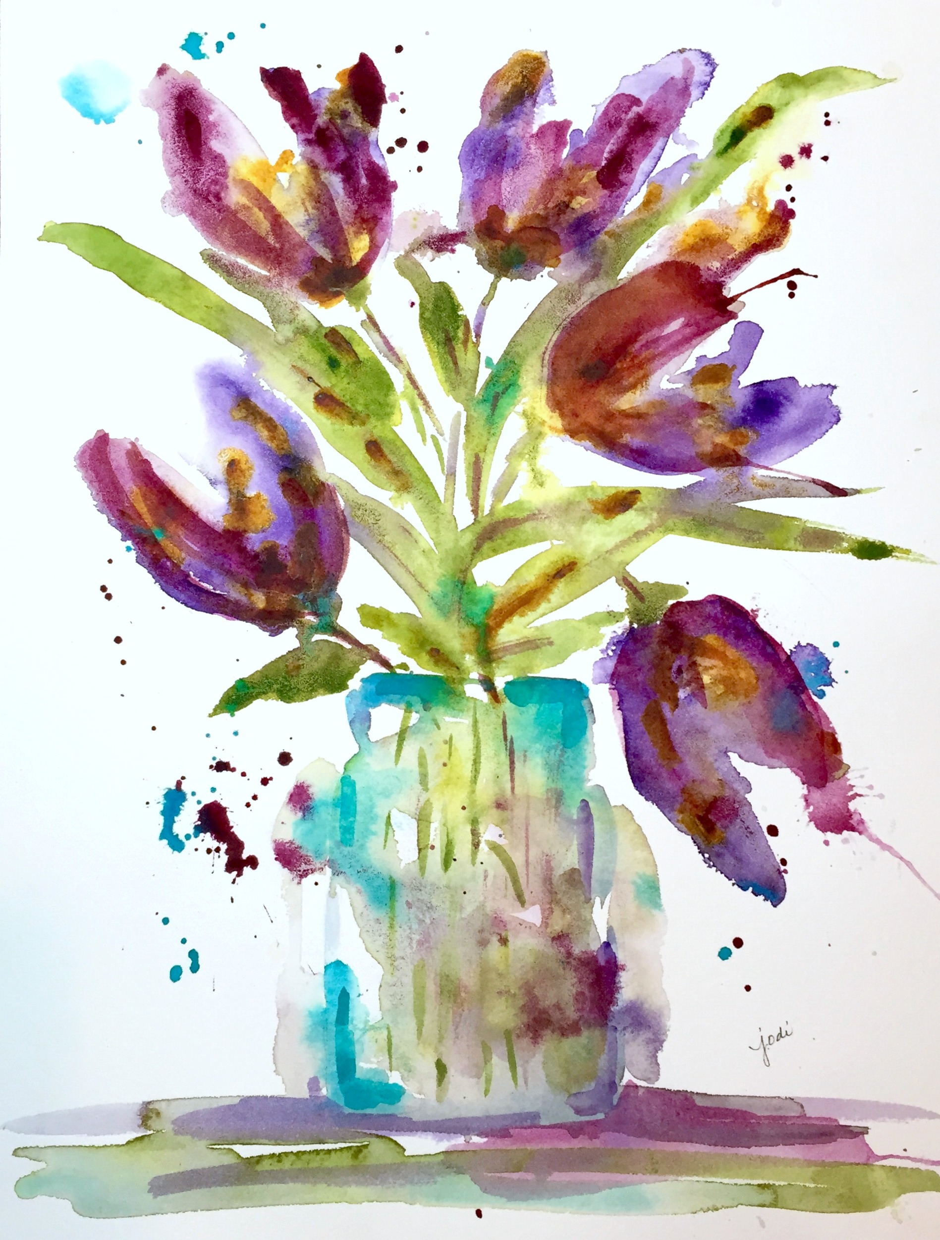
Who knew shades of violet could vary so greatly?!
Before we went away on vacation last week, I had some fun playing with purple in this super loose vase of violet tulips. I have done tulips in shades of reds and oranges in this style, but was excited to try purple.
I decided to mix Winsor Violet (WN*) and Quinacridone Violet (MG**) – two VERY different violets – and touch in some Quinacridone Gold (WN), because I always so love how it moves!
I used Green Gold (WN) for the foliage and a touch of Cobalt Teal (MG) for drama. I shook it, and I splashed on it.
This large 10 x 13 in. painting is done on 300 lb. Arches Cold Press Paper.
I wasn’t sure if I liked it when I finished it, so I just set it aside.
I don’t know whether it is the “curing” of the paint or the “stepping away” that changes a painting so often, but…. when I came home after a week away and looked at it again, I decided I rather liked it.
It’s loose.
It’s kind of wild.
It’s unique and distinctive and venturesome.
It’s Very Variegated Violet!
Cheers & Hugs,
Jodi
*WN – Winsor Newton Professional Grade Watercolor Paint
**MG – M. Graham Watercolor Paint

I like the very variegated violets! I haven’t had much luck yet mixing violets on my palette. I wish I could do paintings like this…more loose, more venturesome. I have been playing around, and I have fun dabbing colors everywhere. I just don’t dab them very artistically LOL. As always your painting is inspiring me to go have a little watercolor fun of my own.
LikeLiked by 1 person
Thanks so much Judith! Splash away! 🙂
LikeLiked by 1 person
It’s absolutely beautiful.
LikeLiked by 1 person
thank you so much sweet sylvia!
LikeLike
I think its lovely! And yup sometimes we just need to walk away for a little for our perspective to change 🙂
LikeLiked by 1 person
in many things – eh C?! 🙂 ❤
LikeLike
This is fabulous, Jody … yes, loose, free, flowing and just gorgeous! Anita 🙂
LikeLiked by 1 person
awh! Thanks Anita!
LikeLike
Just lovely! I like how you mixed the two violets and how loose the painting is. Beautiful, Jodi!!
LikeLiked by 1 person
thanks so much PJ! It is certainly loosey goosey LOL!
LikeLiked by 1 person
Jodi, The flowers are gorgeous, and I really like the way you painted the jar! ‘Venturesome’ is a great word for this lovely work!
Pam
LikeLiked by 1 person
thanks so much Pam! 🙂
LikeLike
Good morning Jodi. There are so many reasons why I love your painting…the delicious colors, the translucent overlapping of color, the subject matter, the freedom in which you painted, and the joy I receive from looking at your beautiful art. Thank you for posting today! Bravo!
LikeLike
This made for a beautiful effect!! Love the mixed violets! It’s gorgeous, Jodi!! 😍
LikeLiked by 1 person
Thanks Charlie! It was a rather bold move I think… lol!
LikeLiked by 1 person
Love the colors and the boldness of your strokes, Jodi. Isn’t it interesting how it looks after some time away?! Everything changes in the art world. We never know what to expect. Particularly with watercolor! I also like the way you combined the warm and cool shades together. I think that makes for yes and happy-ness! I like that you’re trying this in different colors. And working so large! I don’t know how you do it. 💜
LikeLiked by 1 person
Awh! Thanks Loo! It is crazy how it changes when it dries. Sometimes fun – sometimes disappointing. All about the journey of learning and letting go 🙂 Art!
LikeLiked by 2 people
boy, it has so much to teach us. This world would be a really amazing place and so much of the bad would be wiped away if everyone practiced art on a regular basis! ❤
LikeLiked by 2 people
Amen Sista Loo! 🙂 ❤
LikeLiked by 1 person
Splash, drip, yummy violet….I love it! at first when I saw this painting it looked like it was dripping and disappearing after being sprayed by a strong stream of water, a strong sense of movement. Now looking at it for a few minutes, I don’t see that movement but the beauty of the image. I have been thinking that I need to start painting larger after painting a certain size, growing with confidence. How did you like working larger? beautiful job, Jodi!
LikeLiked by 1 person
Thank you so much Margaret for taking the time to share your thoughts! I do enjoy doing larger, but it was very scary at first! You have to be willing to make mistakes and start over sometimes. 🙂
LikeLiked by 1 person
and have a lot of paint! I’ll give it a whirl soon. I do have a larger size painting of the river that I started last year, I am thinking of posting updates on my working at it slowly. Maybe a good way to finish out my challenge. Of course I still want to do my other plein air painting and whatnot. You encourage me to go bigger, even with plein air. 🙂
LikeLiked by 2 people
I wish I had the patience to do a slow project! 🙂
LikeLiked by 2 people
Me too! lol hey, it isn’t easy but when you set your mind to it, but boy is it hard to go slow.
LikeLiked by 1 person
I rather like it also Jodi. Your watercolors are all beautiful, truly they are. Happy Tuesday to you! 🙂
LikeLike
Gazing at your vase of tulips has started my day perfectly. Thank you Jodi 🙂
LikeLiked by 1 person
What a sweet thing to say Susan! 🙂 You made my day.
LikeLiked by 1 person
Love it 💜
LikeLiked by 1 person
Thanks Frances!
LikeLiked by 1 person
I really like the colors and the style. It is fun and cheery!
LikeLiked by 1 person
Thanks Lynn! Purple is fun!
LikeLiked by 2 people
I love purple!
LikeLike
Wow few more tulips 🌷 very refreshing 💕
LikeLiked by 1 person
thanks Snehal! I could paint them forever – lol!
LikeLiked by 1 person
WOWZA!! Loving that purple paint! It is so Jodieeee!! 💜💖❤️ It makes me feel JOY when I see it! 😄🎨👍🌈
LikeLiked by 2 people
Thanks Joyful Jilllllllyyyyy! 🙂
LikeLiked by 1 person
I love the looseness of this one, Jodi. And the colors are scrumptious!!
LikeLiked by 1 person
awh! Thanks Carol! 🙂
LikeLiked by 1 person
I love everything about this picture, Jodi. Wonderful job!❤️
LikeLiked by 1 person
Thanks HS! ❤ (Mary – right?)
LikeLike
Yes, Mary. 😊
LikeLike
Gorgeous painting, love the layers of color.
LikeLiked by 1 person
Thanks Haunani!
LikeLiked by 1 person
I once had a textile teacher tell me you should always use at least 2 close but different colors for every shade…gives dimension. Works for paint too! (K)
LikeLiked by 1 person
even when they are sooo different like these?? 🙂
LikeLiked by 1 person
same family!
LikeLiked by 1 person
🙂
LikeLike
Jodi, you chose a spectacular triad combination with the yellow green/purple/cobalt teal !
this would make a great card on etsy too!
LikeLiked by 1 person
Thanks Debi! I think it may be too large for me to scan to make a card – I have to keep that in mind when doing larger paintings! LOL!
LikeLiked by 1 person
yes, so much to think of tech wise with all the computer gadgetry and software systems parameters!!! but, maybe kinkos could do it??
LikeLiked by 1 person
I think this may look nice on my new purple kitchen wall! Love you! Back in Michigan as of 2:00 am. My dads defibrillator went off a couple times tonight. Ugh. Trying to wind down to sleep. Love you! So glad you had a wonderful vacation.
Pam Griffith
>
LikeLiked by 1 person
Oh no! Sorry to hear! How are things now?
LikeLike
Pingback: Creative Inspiration in Food, Watercolor, Photography, Writing and Life in Between.