Take Flight

Take Flight.

Take flight
above
the turquoise sea,

amidst
the pink and golden
sky.

Stretch
your wings
and soar so high,

let
freedom
guide your heart.

Embrace
the feelings
that you get

when you are
creating
art.

Cheers & Hugs,
Jodi

Just some words and feelings that came to mind when looking at this 5-minute practice painting I did one day experimenting with techniques.

What did I do?  I dropped in some granulating colors – lunar black and quinacridone gold to a wash of alizarin crimson.  I then splashed in some creamy white gouache to create a soft, but dramatic sunset sky.  I scraped in some flying sea gulls with a couple simple scrapes of a palette knife.  I blended cobalt teal with a dab of prussian blue and splashed in some more creamy white gouache.  I then splashed some drops of water from a mister bottle and dropped in just a couple flakes of sea salt.    I then walked away and waited for the magic to happen…. (the hardest part of all).


Red Crimson Abstract Flower Watercolor

Red Crimson Abstract Floral Watercolor 11x14 140 lb coldpress

Red Crimson Abstract Floral Watercolor 11×14 140 lb coldpress

Red Crimson Abstract Floral Watercolor.

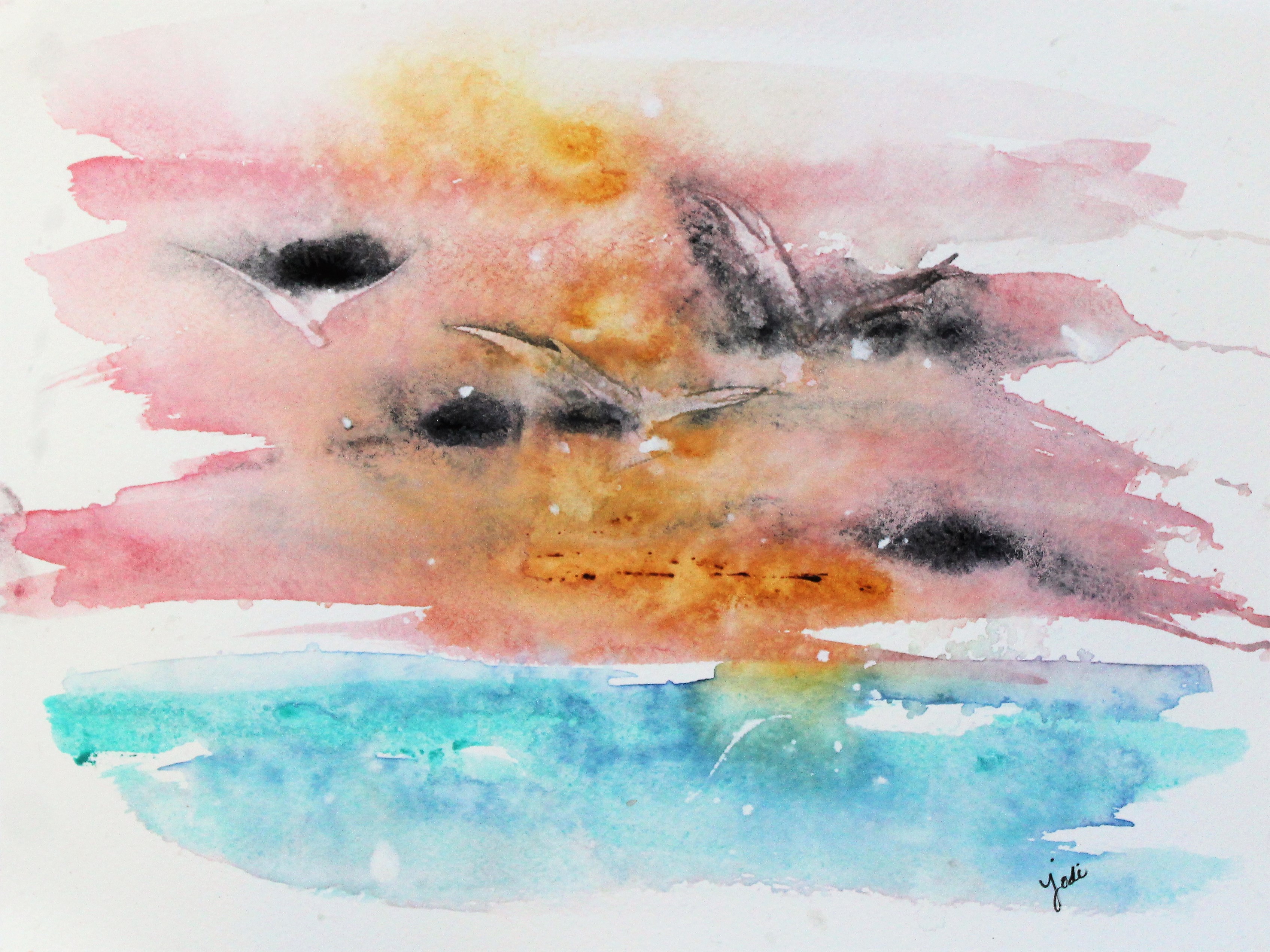
I was reading a blog post by one of my favorite artist bloggers, Debi Riley, where she discussed a technique where she starts her watercolor painting with white….

White!

Those that know a little bit about watercolor painting know using white is almost taboo – as the goal is to “preserve” the white by not painting where you want white/light to remain.  Which, by the way, is a constant challenge, but one that makes watercolor so exciting!

So Debi talked about applying a wet white wash down first and allowing another color to merge into it while it is still damp.  The white paint acts like a soft velvety foundation that the other paints react to in beautiful ways.

I first tried it just on a small 6×9 scrap piece of paper, and then I made three large 11×14 versions (the first two of which were torn up for more scrap practices).  I rather liked how this one turned out, and I want to play more……  more with these colors and more with others.  Such a fun, different way to watercolor!

Paints used for this were Daniel Smith Alizarin Crimson, Indigo, and New Gamboge, along with Winsor & Newton White Gouache.

I first spritzed my paper lightly and randomly with water.  I then painted on some white gouache with a large brush in bold strokes that resembled flower “petals.”  I then dropped in Alizarin Crimson and dragged it a bit in similar flower petal strokes.  I then lightly spritzed again to create movement, and I moved my paper around a bit.  I then dropped in some new gamboge and indigo and lightly spritzed again.  Then the hard part…. wait…. wait… wait – and don’t fiddle.  Walk away and allow it to do it’s own blending while drying.  A couple hours later, I returned to it and saw the fun blooms and splashes created by all the water on the paper.  I added a few more touches of indigo to darken, splashed a teensy bit of crimson, and called it a painting.

What do you think?

Cheers & Hugs,
Jodi


Blue Reflections

Blue Reflections Watercolor – Cerulean and Indigo – 11×14 140lb cold press

Blue Reflections.

Baby boys turned into men.
The future in my granddaughter’s eyes.
The color of the ice caps over Mount Denali.
The color of the sea in St. Marten.
Scoring Boardwalk and Park Place in Monopoly.
Moonlight and starlight in the forest.
Dipping soft sable hair into cerulean and indigo watercolor.
Blue reflections creating magic.

I so enjoyed creating this watercolor painting! I splashed a bit and walked away for a while. I came back and added some more, and walked away again.  And then I did it again.  It was so exciting to come back and see what magic happened, and I so love how it turned out.  When I look at it, I think blue…. and memories flood my heart.

And I smile.

Cheers & Hugs,
Jodi

Released from the Soul

Released from the Soul.

Sometimes…

Art is just feeling.

And no explanation is needed.

There is such a freedom
in simply creating
feeling.

No concern
of whether
someone else

will like…
will understand…
will appreciate…

But such emotion is expelled.

It is like an untold,
secret story
that is released from the soul.

Cheers & Hugs,
Jodi

Learning to Respect the White Space

Cobalt Teal Blue, Lunar Black and Iridescent Gold Abstract Watercolor 11x14

Cobalt Teal Blue, Lunar Black and Iridescent Gold Abstract Watercolor 11×14

Learning to Respect the White Space.

Often times the hardest thing in art
is learning to respect the white space.

As artists, we love color, and we love paint,
and we want to fill the entire space.

But if we do,
there’s nowhere to focus

or to rest our eyes
or our minds.

It’s much like life.

We need to respect that empty “white” space
amongst the busyness

to allow our mind and body,
our heart and soul

to rest
and replenish.

Respect that “white” space.

Cheers & Hugs,
Jodi

Crazy Colorful Pineapple Crown

Crazy Colorful Pineapple Crown Watercolor 11x14 140 Saunders Waterford

Crazy Colorful Pineapple Crown Watercolor 11×14 140 Saunders Waterford


Crazy Colorful Pineapple Crown.

Because it’s Friday…

Because it’s been that kind of week…

Because I needed to just cut loose…

Because why not?

A crazy colorful pineapple crown!

Cheers & Hugs,
Jodi


Power and Strength

"Power" in Perylene Scarlet - Watercolor 8x10 140lb Artistico Fabriano Cold Press

“Power” in Perylene Scarlet – Watercolor 8×10 140lb Artistico Fabriano Cold Press

Power and Strength.

“Power isn’t
doing something
terrible
to someone
who is
weaker
than you…
It’s having
the strength
to do something
terrible,
and choosing
not to.”

– Franz to Reiner in The Storyteller by Jodi Picoult

When I came upon this statement made by one brother to another in the book I am reading, I knew I wanted to paint something that represented Power and Strength, and this painting was born.  It is done using Daniel Smith Perylene Scarlet as I wanted an intense red.  Then the real drama (I hope) is created with a unique rich color made by Daniel Smith called Piemontite Genuine.  It is a shadowy red violet ground from a scarlet-streaked mineral from the hills of Italy that produces lovely violet-brown granulation with a carmine tone.

The color red is associated with energy, war, danger, strength, power, and determination as well as passion, desire, and love.

Red is a very emotionally intense color. It enhances human metabolism, increases respiration rate, and raises blood pressure. It has very high visibility, which is why stop signs, stoplights, and fire equipment are usually painted red.  It is a color found in many national flags.

Other colors used:  Daniel Smith Yellow Ochre, and Cerulean Blue.

I hope you feel the power and strength and intensity I wished to express in this painting, and I also hope the quote resonates with you about the true meaning of power.

Cheers & Hugs,
Jodi

Late Summer Dreaming

"Late Summer Dreams" Abstract Floral Watercolor - 11x14

“Late Summer Dreams” Abstract Floral Watercolor – 11×14

Late Summer Dreaming.

Laying in the warm grass,
looking up at the clouds floating by,
listening to the cicadas sing.

Cool misty morning walks,
hot afternoon ceiling fans swirling,
earlier and earlier sunsets for bright star gazing.

Plump ruby red tomatoes fresh off the vine,
bushels of zucchini for spiraling and shredding and slicing,
roasted sweet corn, and fuzz covered juicy ripe peaches.

Late summer dreaming
inspired layers of transparent watercolor glaze
in varying combinations of Prussian blue, Azo yellow, and Quinacridone rose.

Wishing you sweet late summer dreams.

Cheers & Hugs,
Jodi


Gotta Cut Loose

Gotta Cut Loose.

I've been trying to do a painting for a couple days that is just not happening right now.

Seems when I try too hard and set expectations for myself, it just doesn't happen!

<Ugh!>

So instead of trying it for the fourth time……..

I just let myself cut loose…

and do whatever came out…

and see what happened.

This happened.

And I kinda love it.

I played with some different colors than I've been playing with lately.  This painting has Daniel Smith Cobalt Blue, Perylene Violet, Olive Green, and Quinacridone Gold.

Cut loose and see what you can do!

And in case you don't have the song in your head yet…..

Cheers & Hugs,
Jodi

McKinneyx2designs

Splashing in Quinacridone Rose & Gold

Quinacridone Rose Abstract Floral Watercolor - 8x10 on 140lb Arches Cold Press

Quinacridone Rose Abstract Floral Watercolor – 8×10 on 140lb Arches Cold Press

Splashing in Quinacridone Rose and Gold.

A little diversion from my recent watercolor animal rhyme series back to one of my favorite things to paint – loose, abstract, impressionistic florals!

I broke out my brand new 20ml tube of Royal Talens Rembrandt Artist Quality Watercolor Quinacridone Rose that I won for FREE from Charlie at Doodlewash for #WorldWatercolorMonth.  It was just one of 15 amazingly huge, juicy, luscious 20ml tubes, along with 3 beautiful bottles of Ecoline Liquid Watercolor Paint and 4 markers that I will have hours of fun playing with.

Quinacridones are a favorite of mine.  For this painting, I used three colors, Quin Rose, Quin Gold, and Olive Green (DS) in some big and some small layers and bubbles and strokes.

Oh what fun it was, and I kinda love how it turned out.  This one is going into our McKinneyX2Designs ETSY shop, where I sell original paintings, prints, and cards, and my daughter-in-law, Colleen, makes fun and beautiful rustic signs and decor for the home from reclaimed pallet wood.  (Feel free to check it out and help us spread the word!  And as a thank you from us – if you refer a friend who places an order and lets us know they were referred from your name via the blog, we’ll send you a free box of cards – your choice!  AND if you place an order and let us know you saw it here, we’ll also send you a free box of cards along with your order!)

Thanks again, Charlie, and Royal Talens North America for the beautiful Rembrandt Paints!  I LOVE the Quinacridone Rose and find it to be as lovely as my Daniel Smith and Winsor Newton versions of the same color.

Can’t wait to experiment with more!

Cheers & Hugs,
Jodi

P.S. If you’d like to learn more about Royal Talens North America, who was so extremely generous with this beautiful gift, join me in signing up for their newsletter HERE!