Pink Apricot Watercolor Tulips

Pink Apricot Watercolor Expressionist Tulips - 8 x 10 Fabriano 140 lb Cold Press

Pink Apricot Watercolor Expressionist Tulips – 8 x 10 Fabriano 140 lb Cold Press

Pink Apricot Watercolor Tulips.

I found a few extra moments to steal away to my art studio this past weekend.

I felt like painting some tulips – inspired by our recent trip to Phipps Conservatory‘s Spring Flower Show.

I gave this one a couple tries before I finally decided I liked this version.  I started too tight and too “literal.”  I so admire folks who paint things that look exactly like real life, but it is not my passion.   In my first go, I tried much to hard to replicate the photo.  I then loosened up a bit and created this version that more represents the beauty I felt looking at the tulips.

To me, this painting speaks Joy and Happiness and Life.

And that is what I am feeling this week as we count down the days in wedding week!

Cheers & Hugs,
Jodi

Daniel Smith Watercolor Paints used:  Rhodonite Genuine, Cadmium Yellow Light, Green Gold, Perylene Green

Paper:  Fabriano Artistico 140lb Cold Press

The Colors of Spring

The Colors of Spring.

Tulips in Apricot…

and Crimson…

and bright, sunny Yellow.

Daffodils and Hyacinths in soft pastels of Coral and White.

A strikingly perfect Purple Delphinium.

Azaleas in bursts of Orange.

And the delicate Pink of this flower I do not know the name of that I call the snake flower.

Just a few of the beautiful colors of Spring soaked in at a brief stroll through the last days of the Spring Flower Show at Phipps Conservatory in Pittsburgh, PA this past weekend.

Such a sight for sore winter eyes.

Happy Spring!

Cheers & Hugs,
Jodi

Happy Easter!

Loose Pastel Pink & Purple Watercolor Tulips - 8x10 140 lb cold press

Loose Pastel Pink & Purple Watercolor Tulips – 8×10 140 lb cold press

HappEaster!

Cheers & Hugs,
Jodi

Spring Surprises Popping Up

Spring Surprises Popping Up.

Is anything more beautiful
that the bright pops of purple and yellow
that come in the Spring to brighten the brown and gray
and highlight the fresh new green?

Especially in unexpected places
on unexpected adventures
with people you love
on Sunday “rides.”

Spring is popping up.
Smell the air.
Listen to the sounds.
Look for the beauty!

Cheers & Hugs,
Jodi

It Is Easy Being Green

Snowstorm Stella & Perky Portulacas

Perky Portulacas in Pink & Orange – 8×10 Watercolor on Saunders 140 lb Cold Press

Snowstorm Stella & Perky Portulacas.

Last night
when all the talk was about Snowstorm Stella

that is supposed to be coming our way…
(could a snowstorm have a lovelier name?!)

I thought of my Grandma –
my Stella Star.

And as I painted what started out to possibly be poppies,
they seemed to emerge as perky portulacas.

When I think of Grandma,
I think of portulacas.

Grandma had a next door neighbor and best buddy
who grew the most amazing portulacas.

I remembered hot, lazy summer evenings
with Grandma and her friend and the talks we had.

I remember all the things I learned about life and love
from these special times.

So as I smiled at the snowstorm with the most beautiful name,
I fondly reminisced about my Grandma and portulacas.

And these wild and loose and crazy
pink and orange flowers grew on the page

With joy and happiness
and gratitude and love.

Cheers & Hugs,
Jodi

Watercolor Paint:  Daniel Smith Cadmium Orange, Winsor & Newton Permanent Rose, Daniel Smith Lemon Yellow, Daniel Smith Cobalt Blue


Mixing Basics in Watercolor: Blue, Red, & Yellow


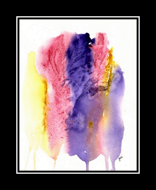
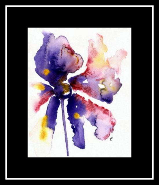
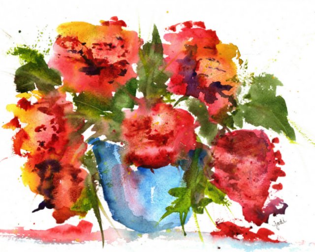
Mixing Basics in Watercolor:  Blue – Red – Yellow.

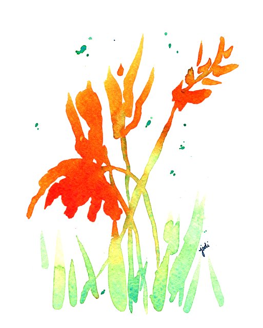
Going back to basics with my new watercolor palette and realizing all the colors that can be created by using three simple basics.  For all three of these simple, loose, impressionistic flowers, I used the same colors:  Cobalt Blue, Permanent Rose, and Lemon Yellow.

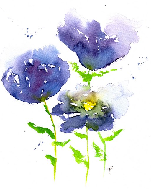
For the first I mixed Permanent Rose with just a drop of Cobalt Blue for the flowers and Cobalt Blue and Lemon Yellow pretty equally for the green.

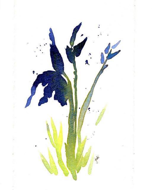
For the second I mixed Cobalt Blue with just a drop of Permanent Rose for the flowers and Cobalt Blue and Lemon Yellow with an emphasis on the Cobalt Blue in places nearer the flower.

For the third I mixed Lemon Yellow with just a drop of Permanent Rose for the flowers and Cobalt Blue and Lemon Yellow, but only a tiny bit of Cobalt Blue to lighten up the green.

And there are likely hundreds more color combinations in various shades that could be achieved by simply using these three basic colors.

It’s fun and easy and creates such clean, bright, un-muddied results when you keep it simple.

I also used one brush for everything – the Rekab 320S #2 Squirrel Mop (which I could only find by ordering from Australia, but LOVE it – also recommended by Debi Riley),  It is so versatile, but I really had to learn to use it after using inexpensive synthetic brushes at first.  This brush holds a lot of water and paint.  It also can come to a fine point and do small lines with a light touch, and can make fat, wash strokes too.

So if you are even thinking of giving watercolor painting a try…. three colors, one brush (you don’t have to order from Australia – but find a nice natural hair medium sized brush to achieve results you will really enjoy) and some paper (I recommend you start with Cold Press 140lb Arches) is really all you need to create some beauty and experiment with this wonderful hobby.

Thanks to the inspiration of Debi Riley on Watercolor Basics!  So much to learn from such talent!

Enjoy the journey!

Cheers & Hugs,
Jodi

I’ve Got the Blues

scan20170227_22045323

“I’ve got the Blues” Watercolor 8 x 10 Impressionist Floral

I’ve got the Blues….

The watercolor blues…

creating shades of purples and greens by mixing Phthalo Blue with Permanent Rose and Hansa Yellow.

Yep – I’ve got the blues…

The Happy Blues.

Cheers & Hugs,
Jodi

Colors Used:  Daniel Smith Phthalo Blue, Hansa Yellow Medium, Permanent Rose.  Fabriano Artistico 140 lb. Cold Press Paper

Watercolor Impressions & Expressions of Friendship in Violet & Crimson & Gold

violet-and-gold-muted-abstract-watercolor

Violet & Gold Muted Abstract Watercolor 8 x 10

Watercolor Impressions & Expressions of Friendship in Violet & Crimson & Gold.

I had fun splashing in watercolor a few evenings this week after Couples Camp last weekend when my sweet Bubby told me she wanted my Illusion watercolor painting, but she also wanted a couple more paintings to complement it for a grouping in her dining room.

violet-floral-illusion-watercolor

Violet Floral Illusion Watercolor 8×10

Bubby is not really a floral girl (so she says), but she also has my Very Variegated Violet painting hanging in her home.  😉

violet-crimson-gold-abstract-drips-watercolor

Violet Crimson Gold Abstract Drips Watercolor 8×10

She is obviously a “purple girl!”  She also loves more abstract art.

violet-crimson-gold-abstract-flower-watercolor

Violet Crimson Gold Abstract Pinwheel Flower Watercolor 8×10

So these are some choices I’ve presented to her to choose from – or not…  Either way, I had fun expressing my love of her through impressions in art.

Cheers & Hugs,
Jodi

Daniel Smith Quinacridone PurpleQuinacridone Violet, Opera Rose, Quinacridone Gold, Arches 140 lb Cold Press Watercolor Paper

Feel free to check out more at McKinneyX2Designs

Upside Down

outdoor-pots-half-off-february-sale-soergels

Outdoor Pots 50% off – Soergels, Wexford, PA

Upside down…

Why?…
when “outdoor pots”

are half off
in the middle of winter…

do I admire
and not buy?

Yet four months later…
I must have,

but that darn sale
is over!

Cheers & Hugs,
Jodi

Peace in Painting

watercolor floral in red - 9x11 300 lb cold press

watercolor floral in red – 9×11 300 lb cold press

Peace in Painting

Splashing water and paint
and creating something loose and lovely
and open to interpretation.

It has been a while since I’ve given myself
the luxury and gift of time to watercolor
with all the busyness of the holidays followed by the loss of my brother.

And what a lovely gift it was for me
to take just 15 or 20 minutes
and lose myself in the process of creativity.

It’s a wonderful thing to take time for yourself
and do something you love, because when you do,
you are a better person to be around.

Thanks to Andrew Geeson for his wonderful
inspiration of loose watercolor painting
that nudged me to do this.

Cheers & Hugs,
Jodi